Thursday, September 30, 2010

Ode to Coney Island

These are some of the first models I made when I started learning Maya about 2 years ago.

I'm still pretty happy with these models, although this was back before I knew much about texturing so you'll notice a lot of n00b mistakes. It was also before I knew much about rendering, hence the pixel-y screen shots and poor lighting.


To do these, I went to Coney Island, took pictures of the stuff there from every angle, wrote down notes about how many planks were in a bench, how many sides were in the gazebo and then started construction from there.

Although my last name causes many people to believe otherwise, I was born and raised in BROOKLYN and am very proud of it. There's something innately gritty, aggressive, and yet charming about Brooklyn and being from Brooklyn.

Coney Island holds many memories for me: from childhood adventures through the amusement park, to teenage romance on the boardwalk, to drunken wandering on the beach, this grimy, bizarre, slightly dangerous location has been a consistent source of good times.

Thursday, September 23, 2010

Couch, How I Love Thee

Here are some screenshots of the model I've been building for the living room for the indie animation film Rob & I are working on:


It was based on these storyboard drawings by Rob:


This scene involves our main character visiting a club which is located "Under-Couch" in "Living Room Lane" - yes, I know, it kind of sounds like "Toy Story." In fact, our whole film kind of mashes up aspects of various Disney greats. Our purpose in intentionally doing so, is in partial parody, partial homage and partial symbolism. But in fear of people ripping us off, I'm not going to explain the plot any further.

What I would like to explain, however, is my process in going from drawing to model.

The intention with the couch is to ensure it looks like both, a hilly environment for the characters (which are animated house hold objects) and a believable couch.

I wanted the arms of the couch to have the same curvature as the arms of the actual couch in my living room. So at first, just to get a sense of the arch, I made this poor-perspective sketch:


Then I needed to break down the proportions: the arms to the base, to the cushion, the cushion to the head board, etc. So I made these sketches to help define it:


Then I started modeling. I started with the arm first and worked from there.

This is the process I often utilize in the creation of most of my models, especially models based off of real life architecture, like benches and gazebos. I will post images of those at a later date. The process of creation with those involved my real life observation, small thumbnail sketches, and written notes.

Interestingly enough, a new freelance gig has got me to thinking about the Theory of Multiple Intelligences. And I think this is why I love Computer Art so much. Computer Art is one part artistic creativity, another part, cold hard fact; and as someone who is as much a Verbal/Linguistic learner as a Visual learner, I work best/feel happiest when I get to utilize both those parts of my brain.

I am able to truly understand form only by breaking down objects into words, then into shapes, then into processes executable in computer programs (i.e. - Maya) :


This is where I differ from most traditional artists, like Rob, or a myriad of my artistic peers - who are better at free hand drawing.

I think the Theory of Multiple Intelligences is worth looking into whether you are a elementary school teacher, or an professor at an art university. Both my junior high and high school understood this theory, and those were the schools I excelled in most and was most passionate about. Not everyone is all logic, not everyone is all visual - in fact, most people are a combination of different intelligences.

Saturday, September 18, 2010

Facebook Grafitti


This one was for my older sister, Crystal. She has always been a huge fan of hip hop, r&b and rap. I grew up listening to her taste in music, but as a whole, it didn't really appeal to me at the time. When she was in high school, her then-boyfriend introduced her to Limp Bizkit, Kid Rock and Korn. They combined hip hop/rap flavors with gritty rock music resulting in the genre of "nu metal." Nu metal got a lot of hate from metal elitists who are generally ironically narrow minded anyway. But I loved it, it really represented who I was as a child of the 90s, and a child of the cultural clusterfuck that is Brooklyn.


This one was for my younger sister, Candice. She really likes sharks.


This one was for my friend Ari who is as colorful and majestic as a peacock.


This was for a friend from college named Chris. He and I, I think, immediately bonded on being some of the few kids in SVA actually from NYC. We were both also rough around the edges and generally misunderstood. I drew this piece for him after a discussion on how many rappers and hip hop artists have stage names that begin with "Lil'" I said it would be funny to have a "Lil' Teapot." Rob and I ran with the idea and it is the short film and series we are currently working on.


This was for another kid I met in college, named Anthony. At first I didn't like him, because he never seemed to do his work, used big words excessively, and gave off this air like he was better than everyone else. Eventually, I came to know him better and even hung out with him a few times. I found out his front was just a cover and that inside, he was a pretty interesting fella.


This one was for Rob. It's a line from a Pink Floyd song and it came on while I was working in Fire Island. It brought a tear or two to my eyes and I realized just how much me and Rob were good for each other.


I really like Facebook Graffiti because it limits you to just the paint brush. Unlike Photoshop or Corel, I cannot use other tools in tandem to make the picture pretty, so I am forced to create form with just color. If I could only paint this loose in real life...

Friday, September 10, 2010

Hyperbolic Chamber

One of the most amazing aspects of human beings is our dual nature. We are both animals with primal instincts and intellects with the ability to communicate. It is our capacity for analysis and categorization that creates for conflicted emotions within us. The wolf, for example, feels no guilt over his murder of a rabbit. We, however, have entire organizations dedicated to making us feel bad about eating a hamburger.

I am always fascinated by the human mind and what it is capable of, with an obvious and particular interest in the trance-like state of creation. The tingling I get in the back of my neck as I become immersed in the world of a story I am writing, or the way I snap back into reality to step back and observe the drawing I just created - these are all inexplicable experiences that enrich an otherwise mundane existence.

One of my most amazing and enlightening experiences occurred to me during my 3rd year of college, in a Layout & Design class taught by the great Donald Poynter. As a typical self-absorbed twenty one year old (at the time) I drew only whatever I'd always drawn. Big breasted women, with long, wild hair. Perhaps this was a therapeutic visual, the process by which I examined my own insecurities. Under many of the teachers at SVA, I was forced out of my comfort zone.

I'd never been really interested in drawing landscapes. Nature was foreign to me, as a born and raised Brooklynite. I was however, interested in composition. And though I would not call myself a photographer, per se, I have a habit of keeping a digital camera on hand to take pictures of interesting compositions of the world around me.

The end of semester assignment came, where we had to complete a myriad of landscapes in varying sizes and mediums, and again, like the average twenty one year old, I waited until the last minute to complete the bulk of the work. I turned to pictures I had taken at the Bronx Zoo and Prospect Park for inspiration.


(more on my website: www.caressesingh.com)


By 4 or 5 in the morning, I got sick of working in tight lines using pencil. I whipped out some watercolors. At first, I over-thought it and applied a base pencil drawing before using watercolors to "fill in the lines." I employed this technique twice - one came out alright, the other, came out very muddy.

Even more frustrated, I attacked the third watercolor in a different manner. I shut off my brain, I did no base drawing, and I just let my hand do what it wanted. The result was this:


Out of the bunch I created in this assignment, this watercolor was both mine and Poynter's favorite. It was the pure result of muscle memory. Like being in the Hyperbolic Chamber of some Dragon Ball Z episode, my hands worked for nearly 24 hours learning the contours of clouds, the way landmass forms, and the way water reflects. Without any direct reference, this piece is a true representation of something that came out of me, and for that I am forever in debt to Donald Poynter.

Friday, July 9, 2010

Rubbing


If you've checked out my website, you've seen this image already. I modeled everything in Maya,textured using Photoshop, enhanced the still's texture in Photoshop and it was lit by the very talented Alejandra Velez (she built a light rig I moved around.)

When I first started this blog, I promised not to make anything very personal, but I enjoy analyzing styles and artistic choices of friends. In particular, I love seeing how a style reflects a personality and how styles rub off on each other. The bits and pieces we take from our friends and interpret in our own voice demonstrate what is strongest about that friendship.

For example, a guy I dated in college is very, very meticulous. It is his extraordinary, almost obsessive attention to detail that I adapted as my own. Proportion and a willingness to go extremely dark in tonality was something I used to ignore. But after seeing how well it worked for him, I adopted it. I still think about him from time to time, and I hope the very best for him, because I can see how much perfection means to him and how hard he comes down on himself when he's anything less than perfect. He'd almost rather NOT do something unless he knew for a fact that he could do it very well.

Once that relationship started to go stale, I paid more attention to a long time friend of mine, Ariella Goldstein. She's known by many for a multitude of talents: videography, photography, special effects make up, graphic design, website building, dj'ing, film editing and fine arts. We met in high school and I had always admired how much of a free spirit she was/is. She dropped out of high school, never went to college, but is very rarely out of work. I guess the difference between us other than my more academic background is that she's a lot more social than I am, and being social is a huge skill to have.

One style we riffed on with each other were these swirly things we're both infamous for.


I did this some summers ago. The main picture was taken at an ex's old apartment (the same ex I talked about in this blog.) The rest were taken in my room in my Brooklyn apartment. All Photoshoped from the comfort of my couch, using my Cintiq.


I did this in the aforementioned summer that I became closer to Ari. It's a keyframe for an experimental animation piece I have abandoned but have since decided to go back to.

Anyway, I've always been a huge fan of clowns. I love the dichotomy of how funny but evil they can be.

Most recently, I've begun dating a long time friend and creative partner. He's also very into clowns. I think we relate on our duality of spirit: being one part childishly innocent, and another part perversely sinful.

We've been working on a new film for which he is doing the character design and animation and I'm doing the writing and backgrounds.


It's a work in progress, and I'll let you know more as time goes on.

Thursday, June 24, 2010

Kare Bear


My older sister used to call me Carey for short. In middle school, a friend converted that name to Care Bear. I adopted the nick name and at the time, I was obsessed with the nu metal band: Korn, so I spelled it with a K.

The nick name stuck, and here is a depiction of my Kare Bear persona.

Saturday, June 19, 2010

The Good, The Bad and The Unorganized


This was one of the first Character Designs I came up with while at SVA.

It was a long process that involved scrapping many, many designs.

I arrived at this visual conclusion after looking at pictures of "50 Cent" instead of squirrels.

The character and storyboard (seen below) were my interpretation of a script by Vjekoslav Grgas about a psychotic explorer whose threat to destroy the home of a group of squirrels lands him in hot water with a specific squirrel - a "gansta" squirrel.


These are select panels from the storyboard. I colored it in Prismacolor pencils and outlined in pen.

I scanned in the sketch of the character design and colored it recently. It got me to thinking about characters.

Aside from having pretty good shows, the USA network on cable drives a pretty cool campaign. "Characters Welcomed" is their recent slogan. And with protagonists like a detective with OCD, or a tough beauty protecting witnesses, it's clear that the network writers strive towards a depiction of flawed but interesting, and ultimately, good human beings.

I've mentioned before I've always been curious about the back story of the antagonist (so you can imagine how thrilled I was when I saw "Wicked.") While I wouldn't condone his behavior, I often wondered why no one sympathized for a second with Scar in the Lion King. I mean, come on, put yourself in his shoes. That whole father-son/king-prince bonding ritual shared by Mufasa and Simba was surely shared by Mufasa and his father. Scar was always left out and no one thought for a moment about his feelings? Why not make him Vice President or something? Give him something more than a den of chuckling hyenas. Of course, Scar went off the deep end, and no one's childhood is perfect and everyone has to mature and learn to deal with it. Still, it's interesting to consider the psyche of the antagonist, and in many ways, we must thank them, for being the shade of black that makes the protagonist shine that much brighter in comparison.

I leave you with a drawing of my thesis protagonist I did while at work sometime last year (don't worry, I wasn't dilly-dallying, I was waiting for something to finish scanning.) Anyway, this is a darker portrayal of my otherwise cute character - a reminder that EVERY character is multi-faceted - with the potential for great good, and great evil.

Thursday, June 17, 2010

Thursday, June 10, 2010

Olive Branch on Nick Jr!

So, I'm SUPER EXCITED because I just saw the first episode of OLIVE BRANCH on Nick Jr.!

Olive Branch is an amazing new short about two creatures who practice peaceful conflict resolution.

It was animated traditionally by the amazing Pablo Smith and shaded by the talented Cassandra Berger - and the flat color was applied by guess who? MEEEEEEEEEE!

So sure, while my part did not require the most skill in the world, it still required a knowledge of how to paint quickly. I remember days upon days of coming in, doing runs, and then getting small shreds of time here and there to get to color it. All through winter, I spent three days of my week at Little Airplane and coloring for Olive Branch was by far the best part!

There were no credits but if you really don't believe me, I'm sure I can put you in touch with witnesses and the animator who will attest to my participation. Either way, it's super thrilling and I hope it's just one of the FIRST things I take part in, to end up on t.v.!

I also laid down the flat color for the second episode and some of the third, but then my contract ended and a new job began. Anyway, this is great.

Check it out at: http://www.littleairplane.com/olive_branch/video/

Wednesday, May 26, 2010

Freeeeeeeedom!


(Quick Sketch of My Feet, by ME)

I've been seeing a lot of my feet lately. It started actually with rendering out my thesis. As anyone who operates Maya know, rendering can be a time consuming process which still requires the attention of the user as many things can (and do) go wrong. Anyway, with nothing to do in those minutes that the animation rendered peacefully, I sketched the closest, most accessible subject: my feet.

Following the end of classes, I re-injured my knee. I first dislocated my knee when I was thirteen. It's an athletic injury most often associated with women because our body shape slightly pulls the knee out. I used to do ballet, which helped strengthen the muscles around my patella; but when I stopped, a slip, trip and fall landed me in a cast and on crutches for a month and physical therapy for a month after. It really sucked having that childhood delusion of invincibility, shattered.

Anyway that's not what this post is about. What it's really about is what I'm doing in this time. Waiting a month for my insurance to reactivate, I've whipped out the old knee-brace and am staying in bed with my legs elevated unless I absolutely, absolutely have to leave my apartment. No parties, no bar hopping, no aimlessly wandering the streets of Manhattan. Nothing.

Nothing but my laptop. And it occurred to me.

While my legs were one main form of freedom, they could sometimes be a hindrance. I like movement, I like to be in movement, to observe movement, to create movement. So, does the inability to go three billion places in one day bug me out? You bet. But all that pent up energy always gets expressed in some other way: by moving other things from the comfort of my bed.

When I lost the ability to dance (or rather became too afraid to) I found solace, freedom, in another medium of movement.


(Procedurally Textured and Animated, by Me, advised by David Halbstein)

I acredit my pre school teachers, mostly. Who distracted me from my separation anxiety with large sheets of paper and my own set of paints. We are patterns occuring and re-occuring. It's almost scary.

We can train and train but at the end of the day, we always revert to instincts in the moments we are most stressed, distressed and pressed for time.

So while I can't really do this in real life:


(Mmm, yummy apple that will kill me if I eat it. Seriously, I'm allergic.)

Freedom exists in the fact that at least, I can pretend to.


(Modeled, Procedurally Textured and Animated by ME, as advised by David Halbstein)

Monday, May 10, 2010

A Visual Look at Composition

Looking at Compositon

I've recently analyzed the movie "Monster" (2003, directed by Patty Jenkins) for a class I had with the thought-provoking, Amy Taubin.

I loved the assignment because it forced me to consider things I hadn't considered before resulting in this epiphany I had in regards to the brilliance of Patty Jenkins.

It's a slightly gory film, and the plot probably doesn't appeal to a lot of people, but I think if we recognize what works so subliminally about this film, we can apply it to our own films and especially as animators, we have the power to make some of Jenkins's visual techniques work even more effectively.

Anyway here it is. Sorry to people that don't like reading, I'll post something visual next.

Written and directed by Patty Jenkins, “Monster” is a glimpse into the true story of serial killer Aileen Wuornos. Set in the late 1980s into the early 1990s, the film depicts the last chunk of Wuornos’s life, ending with her execution. [1] Released in 2003, just one year after the execution of real-life Aileen Wuornos, the film stars an incredibly transformed Charlize Theron with Christina Ricci in a supporting role as Wuornos’s lover: Selby Wall. Ultimately, “Monster” is a film about power – what power is, who in society has power, and what happens to those who have no power at all. By framing characters along alternating diagonals, director Patty Jenkins paints us a picture of a woman who is cornered despite all attempts to rise above her position in life. Jenkins also employs repetition: Wuornos looking at herself in the mirror, the sound cutting off abruptly, hard edged lines in the background visually enclosing Wuornos in a phallic and Apollonian, rigid world. My personal interest in this film is rooted in my sympathy for antagonists. I remember watching Sleeping Beauty as a child and thinking “why didn’t they just make sure the witch got invited to the party?” I believe both Jenkins and Wuornos meant for the life and death of Wuornos to be a message and I believe in listening to every message.

The film instantly introduces us to Wuornos as a young girl whose ambitions are dismissed as silly. As she develops, her life fails to improve. A social outcast, she starts to find a means of connection through sex. To her disappointment, however, she is rudely reminded that these connections are temporary and loveless. Eventually accepting her lot in life, she turns to prostitution to earn her livelihood. After a failed attempt at cleaning up her act and enduring a horrendous assault and rape, Wuornos begins to kill her clients as a way to earn money and gain transport for her and Selby.

This introduction is handled very delicately. Starting in black, a small rectangle frames young Wuornos and becomes larger as the narration takes us through Wuornos’s early life. The sound is limited to an instrumental and no voices are heard despite lips moving. That the frame zooms in slowly, matching the narration, represents Wuornos’s realization that her dreams are never coming true. Finally, when the sound of rain assaults our ears and the frame has hit full screen, any shred of a happy illusion that Wuornos had is washed away from possibility. The images presented in the introduction are no accident. The concepts that these images represent are used constantly throughout the film.

In the introduction, we see Wuornos as a teenager, standing far away from a group of her giggly, female peers. Wuornos’s loneliness is visually emphasized later in the “gay bar” when lesbians seated near to Selby joke about Wuornos’s appearance as Wuornos sluggishly grabs a seat at the bar, alone. This visual token comes up again at the amusement park when Selby runs off with her friends. When Wuornos and Selby exit the bowling alley and some girls are gawking and laughing at them – that Selby is with her is the only thing that keeps that scene from being a reminder of her loneliness because for once, she’s not alone. The introduction also shows Wuornos as a girl staring in the mirror, posing. Wuornos’s narration is “I always wanted to be in the movies” setting an ironic tone for the movie. The next time we see Wuornos in the mirror is when she is getting ready for her date with Selby. Where her dreams once involved becoming a star to the world, they now involved at least being a star to Selby. The mirror viewing comes back with Wuornos admiring her stance with a gun in her hand and then again with Wuornos covered in blood before bathing the remains of her victim off of her body. We watch as Wuornos’s perception of herself changes.

How viewers perceive Wuornos is a direct result of Wuornos’s position in the frame. In the scene in which Wuornos visits her storage space, she is seated on the bottom of a frame that has a high horizon line. The storage lockers in perspective produces a diagonal that extends down, so that she is in the far left bottom corner of the screen, framed by this diagonal. In this scene she is at the mercy of her landlord, who, luckily understands that she cannot afford rent right at that moment. This downward angle is much more apparent in the silhouette of the opening credit, where she is seated on a downward slope – a visual foreshadowing of where her life is headed. The very next time we see this exact silhouette is right before Wuornos is arrested. While in jail, Wuornos is on the phone with Selby and in the background is a shadow against the wall that creates the exact same diagonal line as the slope Wuornos was sitting on. This persistence of shape is meant to tie Selby to the concept of the downward slope reaffirming the viewer’s conclusion that Selby is directly connected to Wuornos’s downfall.

The scene that demonstrates these subliminal diagonals best is the assault/rape sequence. When Wuornos is standing near the car on the highway, considering taking one last John for the night; her position in the frame is higher than that of the man in the car. Once she gets in the car, she is “lowered” she is visually “on his level.” Once he attacks her, he is positioned higher in the screen – which is no coincidence. The camera could have been angled in any direction and still have gotten the point across but that there is some imaginary seesaw positioning the faces of the actors contributes to this idea of a power play. When Wuornos jumps up and kills him, she is above, he is on the floor, and she has won. This seesawing takes place again and again and especially in Wuornos’s interaction with Selby.

The low and seesawing positioning of Wuornos forces the audience to sympathize with her. An audience in 2003, in the U.S. is generally inclined to “not kick a dog when it’s down.” We love a good underdog story, and while we won’t condone Wuornos’s behavior, Jenkins had reasonable expectation that we would understand Wuornos’s motivations. A similar movie probably could not have been made in 1950 and received with the same amount of tolerance and appreciation. Viewers today can understand Wuornos’s desperation because it is also contradicted by her intensity and strength and the great humanity that we do see from her in her loving and protective affection for Selby. Wuornos is extremely proactive – she needs money to survive, she hooks. She wants Selby, so she goes to her house and gets her. Wuornos succeeds as much as she can succeed and this is a good old American sentiment. By catering to some of our values, Jenkins manipulates us into accepting some other things that may clash with our values – such as murder. Casting the beautiful Charlize Theron also elicits some sympathy with audiences. Theron’s natural beauty radiates despite her radical changes (weight gain and prosthetic ugly teeth.) Viewers enter the visual experience with certain expectations in regards to Theron and to their pleasant surprise find that she more than looks the role, she becomes the role – playing on the heart strings of people who never want to believe that bad things can also happen to beautiful people.

Thursday, February 11, 2010

Character Development: Breaking it All Down.

Another reason I enjoy Computer Animation is because it helps supplement my Traditional Drawing skills.

I am the kind of person who really understands through observation.

For six years I studied ballet and tap dancing, although ballet was my absolute favorite! Anyway, we had to practice these hand exercises in order to ensure grace. So when I studied Animation under Howard Beckerman, I decided to put the memory of this muscle movement to the test. The result was this:


It was done on ones, which is why it looks so smooth. If you freeze a frame - you can actually see how crude the drawings are. I did it in Photoshop, using a Cintiq. It is my most recent Traditional Animation and it took me a long time to get over myself long enough to focus just on silhouette.

See, part of my problem while in school, was I kept wanting to show off. Teachers would warn us - a beautiful drawing alone does not make a good animation. But I still wanted to prove myself, I still wanted everyone to see my understanding of tonality which I pride myself on.

Luckily, SVA's Animation curriculum recognizes the importance of flexing the full spectrum of artistic muscles. While studying Anatomy under Stephen Smulka, I did this:


48 inches tall, this giant hand is done solely in pencil. I loved this experience. It was something I didn't think I could do, something I wouldn't even think to do. I did it in the course of a weekend, taking time off from my retail job to finish it. To me, this is what the beauty of SVA is about - you float around for a bit, but then you get some assignments that just turn a switch on in your head, and when you're done, it's like a special high you can't get anywhere else.

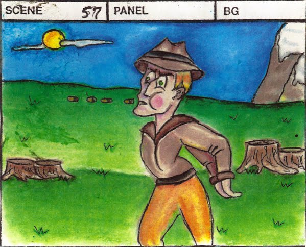
Well, this experience should have taught me that there is a difference between drawing for Animation and drawing for Illustration. Still, when it came time for my sophomore film, I insisted on a complicated character with a complicated color scheme:

As you can imagine, it was hell to Animate. And I spent so much time just trying to get the hair right, that the rest of the film was a giant flop.

Then...something amazing happened!

Under the instruction of the amazingwonderfulomgIlovethisman Eric Eiser, I started learning Autodesk Maya. It was love at first render.

See, in Maya, you HAVE to start with basic shapes, then manipulate them using a wireframe mesh in order to achieve the model you want. This is in many ways, similar to drawing - you start with a basic shape and then expand upon it.

Also, the computer forces you to be honest. Whereas, I can lie to myself and say "sure, I can draw a million frames of that girl with purple hair, and then color her in perfectly a million times" you can't make the computer have more RAM than it does (you know, without buying it.) And even then, there are just still technical limitations to how much you can do with a model.

Consider Naughty Dog's Crash Bandicoot, vs. their newer Uncharted series:


Playstation 1 was a bit more limited in terms of how much graphics could be tolerated, as such, textures for the game had to be more minimal.

For PS3, the development of Core technology allows for the use of a wider set of textures creating for the beautiful gameplay experience that is Uncharted. But BOTH are amazingly fun games. With Crash Bandicoot - they strategically made their characters and layouts more cartoony, to compensate for the lack of capacity for extensive and realistic textures.

With this in mind, I decided to do a bulk of my thesis film in 3D (for more on my thesis, read "2 and 1/2-D")

My approach to character development this time around, was very different.


My first draft was done in Photoshop and the turn around was done in Illustrator. Finally, I was able to embrace simplicity without sacrificing aesthetics!

I then set out to model the character. I had some help from Digital Tutors and observing dolls. The result was this:


Her outfit is in homage to Koko the Clown, and the chopsticks in her hair is in homage to Brien Hindman - a Blue Sky modeler who I studied under, over last summer (he always wears chopsticks in his bun.) At this point, my understanding of textures was very limited, so I focused on other things for a while.

Then I revisted the textures, and upon learning Roadkill, I started applying textures:

(back)

(front)

(three quarters)

I gave her dress a subtle indication of fabric. These juicy details are what will lend her more credibility once inserted into the scenes. These details - that I tried so hard (in vain) to capture in traditional animation are made more effective and efficient in CG.

I even got to detail her hair!


And then, her chopsticks! And her stockings!


I even added black nailpolish to her fingernails.

For her longer bangs, I rigged them as if they were fingers, allowing me even more control of her head. Currently, I am painting weights but I intend to have a test animation done TODAY! So, I'll shut up now and get to work.

Hope you enjoyed!